
Keep it Simple... UX Design

Having done some user interface work over the break I discovered that my design approach was basically to:
- Look around the web for things that I liked and then proceed to 'borrow' their aesthetic.
- Leverage UX/UI frameworks such as Bootstrap or Foundation.
Combining a framework with something I think "looks cool" is a quick win. I can get something created quickly that has an incredible amount of time and effort already baked in to making it usable, responsive and approachable. Given the very wide of use of these frameworks I suspect many others work this way, but also since users are used to seeing many sites built with these frameworks it creates sense of familiarity.
I am definitely not a designer and usually this is a cerebral as I get when it comes to UX/UI design work but I decide to step back and think about what we were trying accomplish. For example what are the base principles that could guide us? I found some good material from Nielsen Norman Group that I want to share (I hope it's OK).
Nielsen's 10 Heuristic Design Principles:
1. VISIBILITY OF SYSTEM STATUS
The system should always keep users informed about what is going on, through appropriate feedback within reasonable time.
2. MATCH BETWEEN SYSTEM AND THE REAL WORLD
The system should speak the users' language, with words, phrases and concepts familiar to the user, rather than system-oriented terms. Follow real-world conventions, making information appear in a natural and logical order.
3. USER CONTROL AND FREEDOM
Users often choose system functions by mistake and will need a clearly marked "emergency exit" to leave the unwanted state without having to go through an extended dialogue. Support undo and redo.
4. CONSISTENCY AND STANDARDS
Users should not have to wonder whether different words, situations, or actions mean the same thing. Follow platform conventions.
5. ERROR PREVENTION
Even better than good error messages is a careful design which prevents a problem from occurring in the first place. Either eliminate error-prone conditions or check for them and present users with a confirmation option before they commit to the action.
6. RECOGNITION RATHER THAN RECALL
Minimize the user's memory load by making objects, actions, and options visible. The user should not have to remember information from one part of the dialogue to another. Instructions for use of the system should be visible or easily retrievable whenever appropriate.
7. FLEXIBILITY AND EFFICIENCY OF USE
Accelerators -- unseen by the novice user -- may often speed up the interaction for the expert user such that the system can cater to both inexperienced and experienced users. Allow users to tailor frequent actions.
8. AESTHETIC AND MINIMALIST DESIGN
Dialogues should not contain information which is irrelevant or rarely needed. Every extra unit of information in a dialogue competes with the relevant units of information and diminishes their relative visibility.
9. HELP USERS RECOGNIZE, DIAGNOSE, AND RECOVER FROM ERRORS
Error messages should be expressed in plain language (no codes), precisely indicate the problem, and constructively suggest a solution.
10. HELP AND DOCUMENTATION
Even though it is better if the system can be used without documentation, it may be necessary to provide help and documentation. Any such information should be easy to search, focused on the user's task, list concrete steps to be carried out, and not be too large.
The main area that I struggle with is keeping it simple and minimal. I tend to want to create "Tony Stark" approved interfaces, yet in the real world I strongly prefer clean simplicity. Check out this example from the retailer Victoria Beckham:
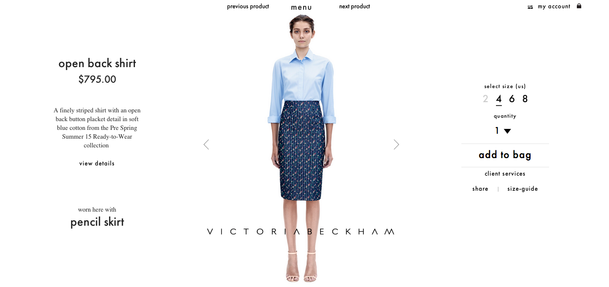
The product is front and center and draws your eye. The navigation is minimal. The buying options are as limited as possible, you can only choose your size. Yet there is nothing missing - I can get more details if I want, or a size guide if needed. To me, this is oustanding UI/UX. It is clean, simple and usable, and it highlights the product and only the product. What is your ideal UI/UX?